Before getting started why are we going to make a pie chart?
To make a pictorial illustration of data we use different types of plots such as bar graphs, pie charts, etc which will let us understand the main plots of the data avoiding the unnecessary plots.
What are the required things to generate a pie chart?
First, we need to import a library matplotlib by entering the pip install matplotlib prompt in the terminal.
The rest of the work will be taken care of with the help of coding.
Why are we installing matplotlib?
Matplotlib is a powerful tool which will let us create visual figures such as bar graphs, histograms, and many more different visual figures.
Now what about the coding part?
import matplotlib.pyplot as plt
Now why am I trying to import matplotlib.pyplot why can’t I directly import matplotlib?
Let me elaborate matplotlib.pyplot is being imported here because it is a plotting library which provides a MATLAB-like interface for creating various types of charts and visualizations.
What do you mean by a plotting library?
A plotting library provides functions and tools to create various types of charts, plots, and visualizations.
import matplotlib.pyplot as plt
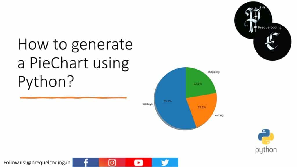
part='Holidays','eating','shopping'
sizes=[250,100,300]
figl,axl = plt.subplots()
axl.pie(sizes,labels=part,autopct='%1.1f%%',shadow=True,startangle=90)
axl.axis('equal')
plt.show()
Now in the second line of code we are going to declare a variable part in which we are going to initialize the activities which we want to include in the pie chart.
In the third line of code, we are going to initialize a variable size in which we are going to specify the size of each portion.
In the fourth line of code we are going to create the figure and an axes of the object using the plt.subplots(), the figl() represents the figure and axl represent the axes of the object.
What are plt.subplots()?
plt.subplots() is a function in matplotlib.pyplot module that is used to create figure and one or more subplots that are axes within that figure.
What do you mean by axes?
“axes” refers to an individual plot or chart area within a figure.
This line generates the pie chart on the axes object axl using the pie() function. The sizes parameter specifies the size or proportion of each category. The labels parameter assigns labels to each category. The autopct parameter formats the percentage labels on the chart. The shadow parameter adds a shadow effect to the chart, and startangle sets the starting angle of the first slice.
In the next line we are going to set the aspect ratio of the plot to be equal, ensuring that the pie chart appears as a circle not like an ellipse.
The show() function is called to render the chart on the screen.